
When choosing between sRGB and DCI-P3, think about your display needs. sRGB is suitable for web use and general tasks, offering decent color accuracy for everyday viewing. DCI-P3 has a wider color gamut, providing richer and more vibrant visuals, ideal for professional projects like filmmaking or high-end displays. Knowing which color space fits your work is key to accurate color reproduction. Keep exploring to discover how calibration can help you get the best results.
Key Takeaways
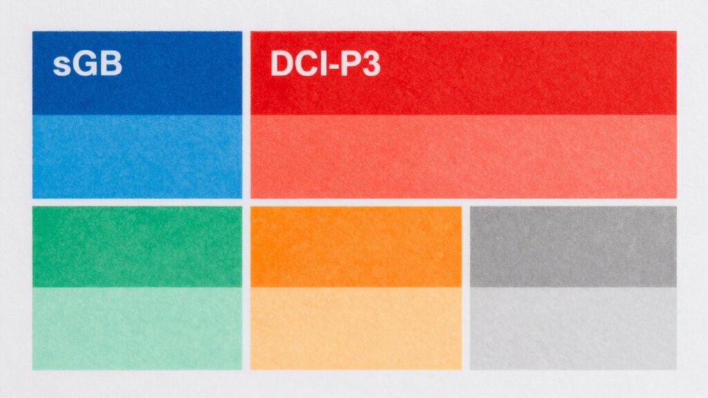
- sRGB is suitable for general use and web content, offering a standard but limited color range.
- DCI-P3 provides a wider color gamut, ideal for cinematic, HDR, and professional display applications.
- Accurate monitor calibration ensures colors match intended color spaces, improving consistency across devices.
- Choose sRGB for everyday tasks; opt for DCI-P3 if working with videos, photography, or professional media.
- Understanding your work requirements and display capabilities guides which color space best meets your needs.

Understanding color accuracy is essential if you want your images to look true to life. Whether you’re editing photos, designing graphics, or just sharing images online, the colors need to be consistent across different devices and mediums. One critical step in achieving this is monitor calibration. When your monitor is properly calibrated, it displays colors accurately, ensuring what you see on screen aligns with the original intent. Without calibration, your monitor might oversaturate or desaturate certain hues, making your work look different when viewed elsewhere. This is especially important if you’re working with high-stakes projects where color precision matters, like professional photography or digital art. Proper calibration also ensures color space accuracy, which is vital for maintaining consistency across various outputs.
Proper monitor calibration is key to achieving true-to-life color accuracy in your work.
Another key aspect to understanding color accuracy involves knowing about different color spaces. Color space comparison helps you select the right standard for your work. The most common color space in everyday use is sRGB. It’s designed for general devices like monitors, smartphones, and the web. sRGB covers a decent range of colors but isn’t as broad as some professional standards. If your goal is to ensure your images look consistent across most consumer devices, sticking with sRGB is usually enough. However, if you’re working in a professional environment—like film or high-end digital imaging—you might need to consider other color spaces.
DCI-P3 is another popular color space, especially in the film and cinematic industries. It offers a wider color gamut than sRGB, meaning it can display more vibrant and saturated colors. If you’re editing videos or creating content meant for modern HDR displays, understanding the differences between sRGB and DCI-P3 helps you make informed choices. For example, a monitor capable of supporting DCI-P3 can display a broader range of colors, resulting in richer visuals. When you compare these color spaces, you get a clearer picture of what your monitor can reproduce and what your final output will look like on different screens.
Choosing the right color space depends on your specific needs. If your work is primarily for web or general viewing, sRGB is sufficient. But if you’re producing content for cinema, high-end displays, or professional print, understanding and working within a wider color space like DCI-P3 can considerably improve your results. Keep in mind that to truly leverage these color spaces, your monitor must be calibrated correctly. Proper monitor calibration ensures that the colors you see on your screen match the standards of the color space you’re working with. Without calibration, even the best monitor won’t deliver accurate color reproduction, undermining your entire workflow.
Frequently Asked Questions
How Does Color Accuracy Impact Professional Photography Workflows?
Color accuracy plays a vital role in your professional photography workflow by ensuring consistent and reliable results. Proper color management allows you to see true colors on your monitors, preventing surprises in prints or digital displays. When you prioritize accurate colors, it streamlines your workflow, reduces rework, and guarantees that clients receive images with consistent, true-to-life hues across all platforms and outputs.
What Devices Support Wide Color Gamuts Like DCI-P3?
Many modern devices support wide color gamuts like DCI-P3, enhancing color accuracy. You’ll find this support in high-end smartphones, such as recent iPhones and Samsung Galaxy models, along with premium tablets like iPads and Samsung Galaxy Tabs. High-end monitors, including Apple Pro Display XDR and Dell UltraSharp series, also feature wide color gamuts for professional work. Confirm your device’s compatibility to take full advantage of enhanced color reproduction.
Can Consumer Monitors Reliably Display DCI-P3 Colors?
Yes, many consumer monitors can reliably display DCI-P3 colors, especially those designed for content creation and gaming. Look for monitors with a wide monitor color gamut and high display color fidelity to guarantee accurate DCI-P3 reproduction. While not all consumer monitors are perfect, more models now cater to this need, making it easier to enjoy vibrant, true-to-life colors in your videos, photos, and creative projects.
How Can I Calibrate My Monitor for Better Color Accuracy?
Did you know that properly calibrated monitors can display up to 20% more accurate colors? To improve your color accuracy, start with monitor calibration using reliable tools like color calibration devices. These tools measure your display’s output and help you fine-tune settings for peak color reproduction. Regular calibration ensures consistent color accuracy, especially if you work in photography, design, or video editing, giving your visuals the true vibrancy they deserve.
Is There a Significant Difference Between Adobe RGB and DCI-P3?
Yes, there’s a notable difference between Adobe RGB and DCI-P3 in color gamut comparison. Adobe RGB covers a wider range of greens and cyans, making it ideal for professional photo editing. DCI-P3, used mainly in digital cinema, offers a broader color spectrum than sRGB but less than Adobe RGB. Consumer displays often prioritize DCI-P3 for vibrant visuals, while professional monitors focus on Adobe RGB for accurate color work.
Conclusion
So, as you explore color spaces like sRGB and DCI-P3, you’ll find that understanding their differences helps you see your content more accurately. Coincidentally, the devices you use—whether your phone, monitor, or TV—often come calibrated to these standards. This alignment means what you see is likely closer to the creator’s intent. By knowing what’s behind those numbers, you’ll guarantee your visuals look just right, turning everyday viewing into a more vibrant, precise experience.